Facebook Beta Is Here!
- Solutions On 2nd, LLC

- Feb 8, 2020
- 4 min read
Sure, change can be scary. But when you use a company's free service to help reach your customers, you have to weather their changes with grace. Don't be intimidated by Facebook's new desktop beta. Get in there and start playing around with it!

Companies like Facebook and Google are always growing and evolving their platforms with one thing in mind: the end user. Not the businesses who use their free programs, but the people those businesses are trying to attract.
So when they make significant changes to the way the platform appears on desktop and mobile devices, it's important to play around with the changes and identify how they may potentially impact your business page or profile. Then prepare for new ways to reach and engage your audience, in case your old methods don't translate well to the new interface.
Meg Note: Just because you might be a late adopter to the new interface, doesn't mean your audience will be. Be sure your About section is optimized and current, so outdated information isn't displaying for Beta users!
Today we're focusing on Facebook Beta for desktop, with screen shots and some initial observations. Sure you can toggle the desktop view back and forth from classic, but like that annoying "Upgrade to Windows 10" alert your PC with Windows 7 started showing you a year or more ago, if you resist the changes today you might wake up tomorrow without the choice.
Meg Note: I still cling to my "word processing" PC and it's unsupported Windows 7, but I did break down and get a new computer with Windows 10 for its inevitable demise. I accept change, I just also really like the familiar when efficiency is my top priority!😊
So if you've been ignoring that little pop-up inviting you to check out the new desktop beta, we've got you covered. Here's what we discovered when we checked "Yes" today!
The Feed
Taking its queue from Instagram, the new feed for Facebook on desktop is clean and streamlined with a viewing choice for light or dark.

One of the things I most immediately noticed was the decreased number of ads and "clutter" on the left and right sides of the feed. And easy access to contacts if you want to reach out and chat with someone.
After that, I did a bit of scrolling and noticed how visuals like images and videos are definitely more eye-catching than plain text posts, making the auto-generated images that accompany links almost as important as the link itself.
Meg Note: This may change over time since part of my right-hand column in classic was also an overview of one of the business pages I manage, but I actually hope that stays away. I monitor my business pages in a different area and don't need to see them on my feed.

The Business Page
The very first thing I noticed on the new Business Page layout is that instead of three columns of information, with the recent post feed in the center, the business information and photos are listed front and center.
Meg Note: Now is a great time to audit those sections for your page, because they are about to be given primo locations. Hit the "View as Visitor" button to see how your page appears!


The key takeaways here were that the tabs on the left of the page in classic now appear just below the page name. Very clean! It doesn't freeze as you scroll though, so if a user is perusing your posts they lose the option to move through media and other page areas. It'll be interesting to see if they keep that setting or update it to remain available at the top of the window while scrolling.
The Business Page Post
The obvious next step was to check out the post drafting box, by clicking "Create Post": we want to be thorough after all! What we discovered were two fun new features for Business Page posts: background color and text formatting options. The latter is available using various online resources, but being able to do this native to the platform is awesome!


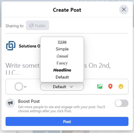
At this stage a few other post features are still missing, so they will likely come on board somewhere down the line. Among the missing: the ability to schedule posts or save as a draft; create a poll; and create a fundraiser.
One of the best new features we found was in the photo editing section. You can now add a caption to the photo directly! In classic if you are creating a post with multiple photos you have to schedule or post it, then go to the post and view each photo to add comments. One item seemingly missing here was the pre-set crop sizes.

Beta Testing Time
Now is the time to get in to the beta and start playing around with the changes! While you are doing so, don't forget to share your feedback with Facebook about how they can make it better. As a beta tester, you can be a part of developing the platform we'll all work so closely with today, and in the future.
Happy exploring!


Comentarios